We continue to acquaint site visitors with works from the collection of the State Museum named after Gapar Aitiev through the eyes of art historian Gamal Bokonbaev. This is the final review of Suimenkul Chokmorov’s works from the museum’s collection. We already announced the transition to reviews of works by other artists last time, but we will do this in the next publication of this series.
We believe that readers of reviews return to something they have already read or, conversely, move forward to the next one. Our reviews are not in chronological order as they are not progress reports.
By publishing these reviews, we want you to have new impressions after reading, perhaps an interest in what you have not paid attention to before, so that you fall in love with some works, and others give you food for new ideas, and also so that you were familiar with the art of our country. Maybe you use them in discussions with friends, and if you are a teacher, then with students.
If you want to share your fine art reviews, we are ready to consider them for publication on this site. We welcome reader comments.
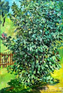 Lilac bush. Oil on cardboard, 69.8×48.2, 1984-1985.
The lone lilac bush is worked out in detail, each leaf is drawn. Solid green grass in the background, apparently – the beginning of summer. The etude is built on shades of green, on combinations: dark – light, warm – cold, transparent – dense. Variety adds a brown picket fence. Still not enough flowers! White, purple, pink! Not enough lilac bloom! This is not a typical image – the lilac has faded! Or did it not bloom at all? Lifeless panicles remain: dark lilac, white-bluish shades of the same green are thinning out, and they take away some of the life-giving juices. There is not enough contrast, everything is in the nuances and the imagination runs into a dead end. And I want to talk about light! Joyful! Blooming! Festive! Made masterfully, magnificently and … too truthfully. Quite subtle realism is not lyricism. Just like in life. There would be a masterful fantasy, an individual interpretation … It doesn’t work about light – you can talk about dark. Modest, respectable, but barren. Colorless, in its own way beautiful, but it is not a pity. It stands alone and does not bring joy. Nobody. Waiting for the gardener to cut it down. He needs it, for wood, for the picket fence. And while the sun shines brightly, it turns green.
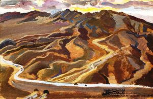 The mountains. Cardboard, tempera. 32.5×49.8. 1969.
Bird’s-eye view. The top is drawn by the contours of the peaks, and the horizon line runs after the roundness of the earth. On a narrow strip of sky dense rain clouds stretched out in a line and block the sun. Orange sunset lights up. And, perhaps, it is reddening earlier in the morning? And the sun hasn’t risen yet? The river meanders between mountain ranges, goes down and is divided in two under the bridge. Its path is crossed by a highway, it shines like a sharp saber and cuts the river into two unequal parts: before the bridge it is winding, after the bridge it is straightened. There are no settlements in sight. People have built their own road from one settlement to another and are not going to stop here. They are transit passengers for the mountains. And their construction – economical, soulless, direct – violates the beauty of nature. Roughly perpendicular to the winding lines of the mountain ranges. The artist fantasizes: the river becomes an arrow, and the road becomes a bow shaft… without a bowstring? The artist philosophizes – the path of the river to a person who has his own path; is harmony possible? No answer. The artist is trying to fit a non-natural object into nature. And he doesn’t succeed. The contrast is antagonistic. One subjugates the other. A person is inspired by nature, its power and greatness, and … remains a stranger to it … Only a narrow strip of the sky is transparently written. And the mountain ranges are dense. Justified. The sunset was made naturally burning and the road had to be made as tight as possible. On the edge. The artist understood the essence of what was being depicted, but the aesthetics of the work suffered … Still, this is a sunset. Travelers could not find themselves in such a beautiful place so early! magnificent! deserted for miles! place..
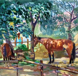 Tulip with a foal. Cardboard, oil. 40.7×42.5. 1983.
In the shade of trees near the feeder stands a mare with a foal. The white-bearded owner in a white cap and blue T-shirt brought them fresh clover. A clear summer day, the sun’s rays break through the green foliage and draw fantastic patterns on objects. In the distance, the sky and the river are blue, the hills and greenery are glowing. Breathe easily, coolness from the earth, warmth from the rays, the smell of grass and domestic animals. A kaleidoscope of light and dark, cold and warm, dense and transparent, multi-colored spots. They destroy the regularity of the form and turn the space into an entertaining game. But a mare with a foal is too similar to … life. To everyday reality. The horse’s muzzle is blocked by a tree and it’s just like that, it’s about nothing – it’s not a symbol. The poor foal generally “hit” the wrong angle. The artist simply depicted what he saw, and for some reason was sure that it was will be interesting to the viewer. Perhaps this is the most controversial painting by the master in the collection of the National Museum. The mare has an incomprehensible nickname: Tulip is masculine*. Perhaps it is possible with horses… She is a Tulip. Many draft horses are characterized by a somewhat elongated arched back, they are strong and hardy, but not suitable for riding. Yes, such details are more important for the peasant economy than some abstract spots. And even more important – koumiss!
*In Russian, this word has a masculine gender, but there are no genders in Kyrgyz
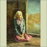
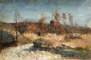 Late fall. Cardboard, oil. 20.8×30.7. 1957.
The earliest of the author’s works in the museum collection. He painted it when he was a student at the Frunze Art School. A small sketch made in the floodplain of the river. The morning sun gently illuminates yellowed trees, shrubs, grass. Dull ocher dominates. The brown slope of the valley darkens, the tops of the trees darken in the blue-gray sky. Light grass and stones ahead. Beautiful coloring, stylish and… monotonous. Water could add variety! It’s not a river, is it? Even if it is a river, it seems to be frozen in place. Most likely, after the flood, an anhydrous branch appeared in the floodplain. It would be quite sad if it were not for the accent – a lonely figure in a light hat with a red knapsack behind his shoulders. The black traveler creates tension. The mood of calm and serenity disappears. A man has crossed a waterless rocky bed and is moving on. What’s next? New meetings, promising acquaintances or bitter disappointments? The line of the traveler crosses the line of the phantom! This is not a good sign. Or maybe everything is much simpler? It would be nice if a person had a … bundle of brushwood behind his shoulders. Then everything is clear … but the red knapsack is annoying, and a sense of anxiety comes through in every line of this talented sketch.
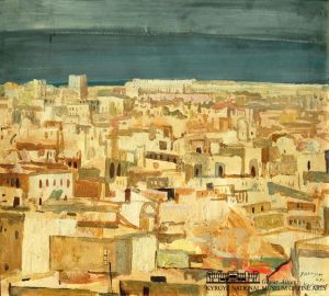
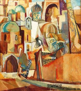 SAMARKANDIAH (composition). Oil on cardboard, 44.8×39.8, 1970.
Blue domes of Samarkand! Arches, minarets, blank walls, small windows, narrow streets. The eye highlights decorative grilles that protect from the merciless sun: they resemble the diamond-shaped frame of a yurt. Ocher, cobalt and mars brown, transparency and density. And in the center of the composition is a dazzlingly white, deserted square. The play of forms excites the imagination. She imagines a beauty wrapped in silks, and in front of her, across the street, suitors rise diagonally. Guards the entrance to the grand palace in a magnificent collar; behind the fence, a warrior in wide robes is worried, a little more and he will draw his saber; a circus performer on stilts, ghostly as a minaret, gazes at them from a distance. And now the square was filled with characters, they almost covered it with their excited bodies. Buildings put on headdresses, opened multi-colored eyes. Samarkand! Where is the name from? Kuzma Petrov-Vodkin published a wonderful book “Samarkandia”, in St. Petersburg, in 1923. The name comes from there, but there is less orientalism and exoticism – more fantasy and theater. Where does the word “composition” come from in the title? As if it is necessary to specifically clarify that the picture is the composition. It was such a fashion! The fashion was spread by the studios of the Senezh Design Studio. Since then, it has become fashionable in the USSR to call picturesque paintings “composition”, and artists – “composers”. The main thing was formal exercises. Many fell for this bait: they confused the design with an easel painting, but the talent did not allow the author to drown in meaningless forms. He began to revive the composition! He boldly crossed the forbidden line, because design is pure abstraction, there are no mysterious beauties and lustful men.
 Khartoum. Cardboard, tempera, 44.6×50, 1975.
Impressions from a creative trip to the capital of Sudan – Khartoum. The artist was inspired by unfamiliar architecture that does not exist according to Soviet laws. Spontaneous. Arabic, ancient, traditional, stylish. Such architecture seems to the author cozy, even a little theatrical. One-story housing: walls, fences, doors, windows, courtyards and narrow streets. Each item is unique, like a work of art! It is crowded here, there are problems with communications and clean air. But for the artist – it’s decoration. And where the structure is incomprehensible, beautiful abstract spots are used. It seems that it is more interesting to live in these bizarre forms. There are also modern buildings, they soullessly loom on the horizon. The master correctly caught the main, color and tone, correlations: a greenish-gray sky and golden buildings. The sun is in a haze, the lighting is soft, the horizon is dark from the clouds. Or maybe it’s water? The city is located at the confluence of the White and Blue Nile … It is written transparently, in one movement – this is so highly valued in watercolor and is valued in general. This is lightness, grace, skill. Khartoum is the hottest major city in the world. But the landscape exudes moisture and coolness. Perhaps the artist got on the only, not very hot day of the year. Artists of Soviet Kyrgyzstan did not pay attention to Soviet cities, they seemed im not romantic. And today, artists are not inspired by our construction boom, and … they are doing the right thing.
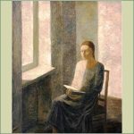
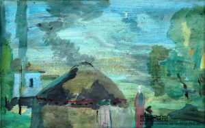 Twilight. Oil on cardboard, 25×38.3, 1978
The sun had just set, and the light was still lingering for a while. The air does not want to part with daytime cheerfulness. Earth and sky give away the accumulated energy and in every possible way delay the onset of night. They do not want the onset of darkness, since the sun has gone, let there always be … twilight! Everything has become tonally typical, not dark, not light, and not gray – transparent! Barely noticeable month. What is there to enjoy here? What to look into? Twilight is the time of the master! He loves subtle shades. He physically feels transparency, like watercolor water, when light radiates… cardboard… A woman with a child is standing near the yurt. Looking into the fields. Waiting for her husband from work. Or maybe darkness? Or maybe she was fascinated by the yellow-cold month. There is smoke, there is a hearth in the yurt, but it does not give heat. Cool colors all around. Trees bring some comfort. And the baby is cute. But this is not enough. Nearby stands a house on a high dark gray foundation. Empty house…. Stop moping! Now adults and men will return from the fields, bring warmth and news from the big world, turn on electricity, and everything will come to life.
The artist follows the archetype: a woman with a child is waiting for a man from work in the evening. It has always been so, from century to century. Now it looks like a pattern. Or maybe not…. The artist recently starred in the film “Ulan”. In the cinema, it was told about how the separation from traditions adversely affects a person. How difficult it is to keep roots in an asphalt city. A small sketch is written masterfully: through the texture of the cardboard, the mastery of the soul peeps through! There are two houses nearby, and a yurt looks more soulful and warmer.
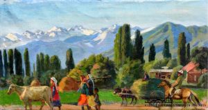 Morning in the village. Canvas, oil. 33.7×64.3. 1985.
The procession marches into the fields, pastures. The cow walks in front, then the owner of the cow follows, then the women walk to harvest hay, they have pitchforks and a child next to them (probably the kindergarten has not yet been built – a flaw of the Soviet authorities). The donkey has been working since early morning, carrying a whole cart of hay (when did they manage to collect it?). A rider gallops at a trot. The usual summer-autumn landscape: mountains, poplars, haystacks, buildings. Simplicity, beauty and morning freshness. The artist glorifies the desire of ordinary people to just work. And how good it was! Everything is common, everything is national, everyone works together! And at the same time: everyone has time to deal with their personal household. No one interferes with anyone and does not envy. Everyone wishes each other happiness and kindness from the bottom of their hearts. Harmony, a sense of unity with grateful nature, a bright, conflict-free world, without illness and adversity. There are subtle life observations, but so far there are no exact natural characteristics. While this is an illustration where lightness is needed, the complexity of an easel painting is inappropriate. So far, this is theatricality: the peasants, as if on a mise-en-scene, rush to work and nothing else happens. This is a good start! And the author would further add complexity in meanings and concreteness in details. I would add a small dark corner for contrast. A promising study for creating on its basis a major thematic work in the style of socialist realism. But the author did not modify it. Other times come, other ideas come.
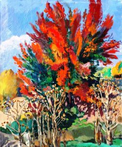
Red apricot. Oil on canvas, 60×44.5, 1986.
The artist’s attention was drawn to the plot: apricots and thistles. Both faded in the sun, but one turned red and beautiful, and the other a deathly yellow. The thistle dried up on the spot, and the apricots were transformed. This is a worthy answer to the scorching sun! Can painting tell about it? In an effort to convey his feelings, the artist takes risks and uses a strong technique – red brings to fury. Such color disharmony is perceived in abstract art, but not in realistic works. She looks like a waste of time here. Connoisseurs will say: “So red on blue? Where is the restraint of a professional? What about harmony? What about realism? And the light-air perspective? All right, but there are extenuating circumstances. There is a perspective. The thistle is ahead not due to color and tone, but due to the prickly shape. The development of space in depth stops the clay duval, the shadow of a tree “hits” on it. The plane of the shadow delimits the spaces – before and behind. But even behind the duval, the color does not calm down. And here the sun and dissonance dominate. This is what the artist wanted. This sequence – bushes, tree, wall, distant view – form a compositional perspective. The viewer does not notice this technique – he sees the space of meaning … The sun is scorching mercilessly. In one case it burns out; and in the other – hardens. Why is that? Unclear. Many will answer – the breed … Why did this story attract the author? Did he see his destiny in him? He boldly straightened up towards the dangerous sun and became furiously red and hardened by eternity.
Telegram-channel in Kyrgyz & Russian:
Санжарбек Данияровдун коомдук фонду
Фонд Санжарбека Даниярова
Subscribe if interested